
Website concept
FoldTech Doors
Discipline
Specialty doors
Studio role
Strategy, design, front-end
Status
Concept presentation
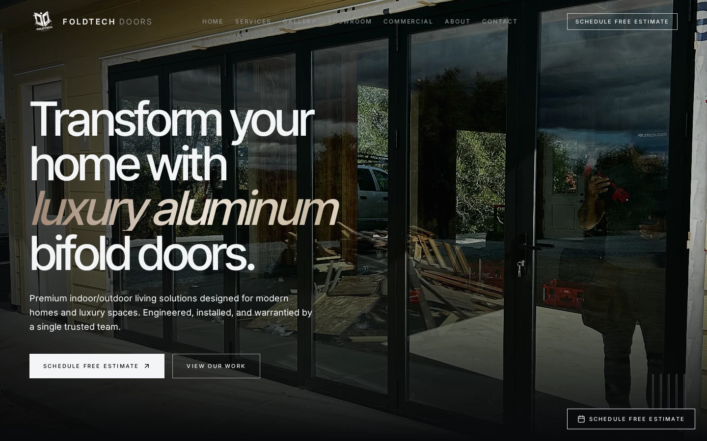
Overview
Doors like these are judged by eye, so the concept treats the website as a showroom: wide, uninterrupted imagery, restrained supporting text, and one obvious way to start a conversation.
The layout is deliberately quiet. Text sits on a narrow measure so it stays easy to read, while the photography is given the full width of the canvas.
Design focus
Imagery and headline together
The first screen pairs a large installed-door photograph with a short, plainly written headline, so a visitor sees the product and understands the offer at the same moment.
Quiet supporting text
Generous line height, short paragraphs and clear section headings keep the supporting copy scannable rather than dense.
Controlled palette
A dark, near-neutral palette keeps attention on the metal, glass and surrounding materials in the photography.
Page experience
- 01
Entry
A full-bleed image establishes scale and finish quality within the first screen.
- 02
Sections of work
Further sections continue the same pattern: one image paired with a short, factual description.
- 03
Inquiry
A consistent estimate action sits at the natural decision points instead of competing calls to action.
Desktop and mobile
On desktop the composition uses wide horizontal bands so a single image can occupy the viewport without crowding.
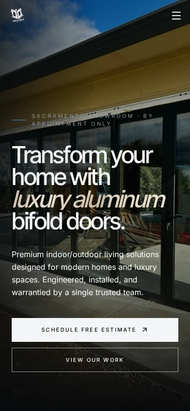
On mobile the same bands stack into a vertical sequence with taller imagery, keeping product detail visible at arm's length.
Next project